✨Happy New Year✨2023 calendars are 23% off from January 23 to February 23📆Discount applied at checkout 🎉✨Happy New Year✨2023 calendars are 23% off from January 23 to February 23📆Discount applied at checkout 🎉✨Happy New Year✨2023 calendars are 23% off from January 23 to February 23📆Discount applied at checkout 🎉✨Happy New Year✨2023 calendars are 23% off from January 23 to February 23📆Discount applied at checkout 🎉

Hannah Lee

WorkAboutShop

I’m Hannah, a freelance designer and illustrator in Toronto. I create visual identities that have a clear point of view.

Selected

Saje

A brand refresh rooted in the power of plants

Branding, Art Direction

2024

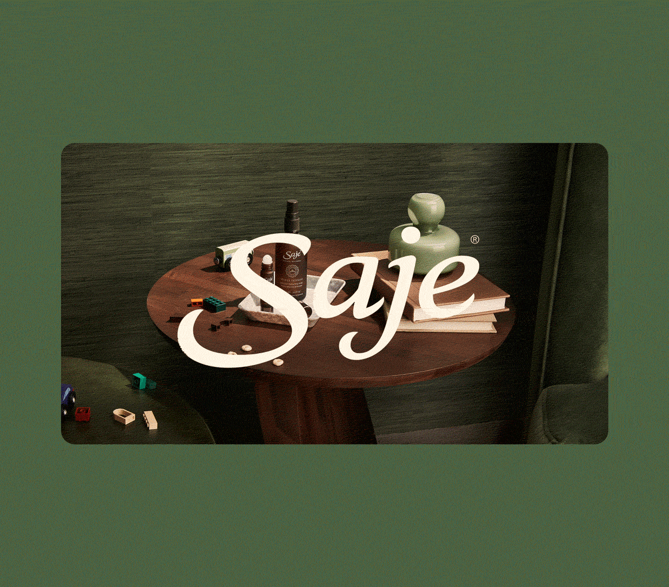
A brand transformation for Saje, a Canadian health and wellness brand, focused on using the natural power of plants to address modern discomforts. The new design system highlights the brand’s signature brown bottles, adding meaning and ownership to its identity. We used browns, greens, and jewel tones to reflect boldness, incorporating Rx-inspired visuals and prescription bottle labels to better showcase the products. The approach is editorial, candid, and raw, replacing the typical zen aesthetic with a refreshing sense of humour and modern sensibility.

Posts by Read.cv

Onboarding experience for a community app

Illustration, Iconography

2023

Posts is a community app by read.cv that aims to be “a café in the city center. A space to share and debate ideas big and small, grow and learn with friends old and new, and get a pulse on the city around you.” I worked with Andy and the read.cv team to create a series of onboarding illustrations that captured this philosophy, and felt cozy, vibrant, and welcoming.
We’ve since made more fun things like app icons and egg shirts.

Valise

Branding for an artwork inventory software

Branding

2024

Valise is an artwork archiving and management tool for artists. I worked with the founders Ross and Brian to create a visual identity that communicated the software’s ease of use as well as the professionalism and expertise that they bring to the table.

The name Valise is based on Marcel Duchamp's work La Boîte-en-valise, which offered a selected overview of his work as an artist in the form of miniatures stashed in a fold-out carrying case. The icon mirrors this expansive fanning out effect, and the graphic elements visualize the modular aspect of a traveling archive.

Family.co

Illustrations for a friendly crypto wallet

Illustration, Iconography

2023

Family is a friendly self-custody Ethereum wallet designed to make crypto easy for everyone. I worked with the founder, Benji, to create bespoke illustrations throughout the website, as well as a set of unique icons and shapes to be used in various applications.

Veritree

Restore trust in a brand restoring the Earth

Branding, Art Direction

2024

Veritree connects mission-driven companies with nature-based solutions and technology to restore ecosystems with enhanced transparency. Through advanced tech and on-the-ground monitoring, it tracks and verifies reforestation projects, addressing skepticism around corporate carbon offsets. The rebrand focused on building trust, enhancing the company’s credibility with scientific textures, clean type, and a friendly tone, paired with authentic photography. This shift improved the brand’s overall trustworthiness. I also worked with the product team to enhance the user interface of the monitoring console.

Empty

Icons and badges for a simple fasting app

Illustration, Iconography

2024

Empty is a simple intermittent fasting tracking app. I worked with founder Raffi to create 18 app icons and 48 badges, customizable as a part of the app’s six colour palettes, as well as other illustrations throughout the app.

PC Children’s Charity

Branding a cause that feeds learning

Branding, Art Direction, Illustration

2019

Backed by one of Canada’s most prominent food labels, President’s Choice Children’s Charity has the passion, reputation, and resources to feed hungry children and teach them about the importance of nutrition. In re-branding, we needed to show that only a well-fed child has the foundation to learn, grow, and succeed.

Classic schoolhouse typography, bold illustrations and fresh, nutritious food are major sources of inspiration for the identity. The modularity of the design system shows that kids have limitless potential when they are empowered; because kids who eat well, do well.

No Frills Hauler

Redefining what it means to save money

Branding, Art Direction

2019

No Frills, a Canadian discount supermarket chain, is known for its eponymous no-frills approach, which keeps prices low for customers but often results in a lackluster shopping experience. We embraced this by turning saving money into a badge of honor, creating the “Hauler” identity for shoppers. We teased the campaign with cryptic posters and streetwear, leading to a music video that redefined the No Frills shopping experience. The success of the campaign led to a second year, expanding the Haulerverse with a 12-track album (featured on Jimmy Fallon!) celebrating the joy of saving on groceries.

Xie Xie, Ollie

Poster and titles for a short film

Branding, Illustration

2023

In James Michael Chiang’s short film Xie Xie, Ollie, a biracial man discovers challenges and complexities he may not have expected in his efforts to connect with his Chinese heritage. I worked with James to illustrate a poster for the film as well as design the opening and closing credits. The visual language stems from Ollie’s personal struggles with his mixed identity, with sketchy handwritten type and cloudy shapes that obscure Ollie’s face.

PC Optimum

A loyalty program that rewards your everyday

Branding, Art Direction

2017

PC Optimum had the challenge of being a merger of the two largest loyalty programs in Canada: PC Plus and Shoppers Optimum. It had to signal an exciting start of something new, while maintaining familiarity to the programs’ existing users.

The result: a visual language of graphic elements representing two things coming together. Geometric shapes join to form the logo, and when pulled apart, become confetti-like and celebratory. The approach is modern, fun, and dynamic, and is highly recognizable in stores across Canada.

Calendars

An ongoing personal project

Illustration

2025

Going stir-crazy in the middle of the pandemic madness of 2020, I felt like I needed to create something from scratch in order to make sense of my life. I drew, designed, printed, and shipped these calendars as a gift to friends and family for the holidays, as a thanks for keeping me sane. Over time it led to an online shop, and these calendars have connected me to lovely strangers all over the world.

Buy the 2025 Calendar from my shop!

Miscellaneous

Design and illustration for other clients

Branding, Illustration, Iconography

2025

An illustration of a nice, green lawn chair

I’m interested in how creative work is used to start conversations and ask meaningful questions about the world.

I have nearly 10 years of experience creating thoughtful, intentional work that celebrates experimental and strategic ideas.

I feel the most fulfilled when I make things that have their feet on the ground—rooted in, and contributing to, the world at large.

Be well. Do good. Don’t overcook it.

Say hello!

Hannah Lee

WorkAboutShop

Nothing in your cart.
Take a look at the shop →